.webp)
DESIGN
Publié le
tuesday, 7th july 2026
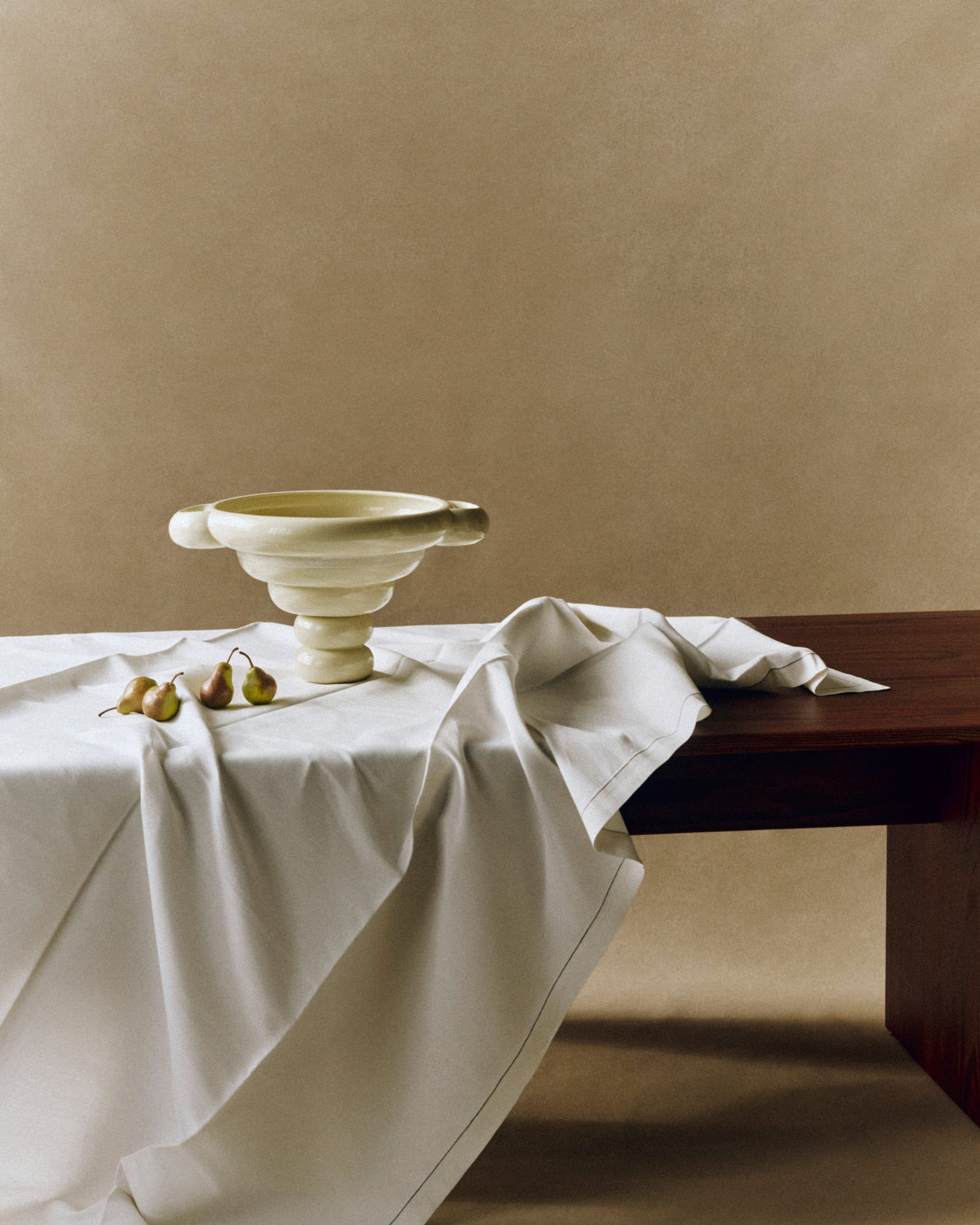
Between the ancient amphora and the dining table of her own apartment, Louise Roe shapes objects that tell a story before they're even filled. With the Alice Object, the Danish designer signs a porcelain piece with generous curves and sculptural handles, born from an instinctive dialogue between classical craftsmanship and a contemporary vision of living well. Made in Portugal and available in three sizes and two shades: pure white and butter yellow, this object, conceived as a showcase for fruits and vegetables, takes its name from a source as unexpected as it is endearing: her dog, Alice. For S-quive, Louise Roe looks back on the genesis of this piece, the technical challenges posed by large-scale porcelain, and her own particular way of composing interiors like living still lifes, balancing Bauhaus rigor with Haussmannian elegance.
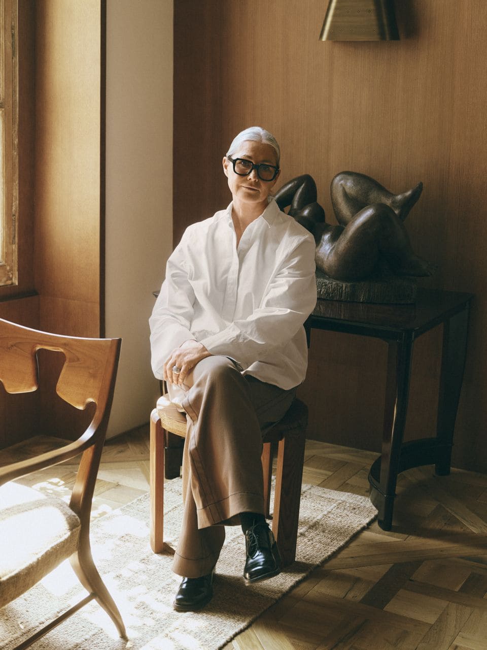
The Alice Object draws inspiration from the ancient amphora. How did this dialogue between antiquity and contemporary design come about in your work?
It can be the final and small details that creates the character. I had in mind to start with an uplifting base and shape being bigger and embracing the stuff to be put inside. It makes it also elegant standing there showing and telling something for the eye… As the design evolved, the five wide rings that form the body naturally called for larger handles on either side. At that point, the dialogue with the ancient amphora emerged almost instinctively. References to antiquity became a defining part of the design, not through imitation, but by reinterpreting the amphora's timeless proportions and presence. Those elements ultimately gave the object its distinctive character, creating a meeting point between classical tradition and contemporary design.
You describe a gradual resemblance emerging with your companion Alice during the shaping process. Do your creations often come to life intuitively and organically, rather than from a predetermined plan?
I often have an idea and not a complete plan as there must be room for ideas coming along in the process of creating an object. I am quite good at imaging the object in a room, and I am often sitting at my dining table in the room where the designs belong. Alice didn´t have a name before the in the last process and suddenly it made sense to call it Alice with the sensibility both porcelain and my dog Alice have. “Alice in Wonderland” also refers to a lot of fruits and colors and the Alice Object is made for displaying all kind of colorful fruits and vegetable as they are all individual sculptures which deserves to be seen.
"You can say interior for me is like composing, orchestrate, balancing and making sure each object has its role in a bigger play."
Porcelain is a demanding material. What drew you to this medium for this particular piece, and what challenges did it present in terms of craftsmanship?
Porcelain is brunt in the kills at the highest degrees compared to the other ceramic clays which makes it the hardest and strongest piece. Porcelain is often used for tableware and not decorative items. I knew that using Porcelain for Alice would give this object its best material but also knowing it would be a challenge to make such bigger items than you normally see in porcelain. I had a few rejections from other suppliers saying this is not possible but one was willing to try. It was not easy but with a positive mind and willing to change standards methods we all made it happen. The bigger handles made it heavy at top and when the clay is wet and needs to dry the handles want to go downwards…I suggested to make it dry upside down and the top edge with no glaze. just the colored clay raw to show that the porcelain is a colored clays and not just glazes with a color on top.
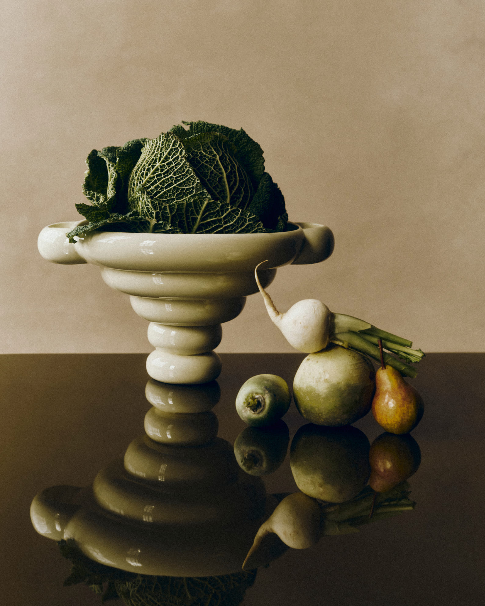
The Alice Object comes in three sizes and two shades: white and butter yellow. How did you define this palette, and what does each colour express to you?
Porcelain is often associated with white, and for this object I felt it was an inevitable choice. I love the smooth, glossy surface, and the purity of white allows the curves to come alive. The changing light creates subtle shadows that make the form even more expressive. Butter Yellow was a natural addition because it is such a warm, welcoming, and friendly colour. It complements almost any fruit or vegetable placed inside the object. Just like butter itself, it is a simple yet essential ingredient in cooking.
You speak of creating a kind of "living still life" around this object. How central is this notion of visual composition to your broader approach to interior design?
You can say interior for me is like composing, orchestrate, balancing and making sure each object has its role in a bigger play. I am often not fond of too many and too much going on since individual pieces can do its still life on its own if it has already a caracter.
"The masculine clarity of Bauhaus and the feminine elegance of the Haussmannian style complement one another naturally."
The object is made in Portugal. Is the choice of manufacturing location for you as much an aesthetic decision as an ethical one?
When choosing craftspeople and manufacturers, their skills and expertise are my first priority. Equally important is that we share an understanding of each other's creative language and have mutual respect for the craftsmanship, methods, and processes involved in bringing a design to life. I have found Portuguese makers to be open-minded, collaborative, and willing to embrace new ideas and challenges. With decades of experience in ceramic production, they possess an exceptional level of knowledge and craftsmanship. Another important advantage is the proximity of Portugal, which makes communication easier and keeps transportation distances relatively short and more sustainable.
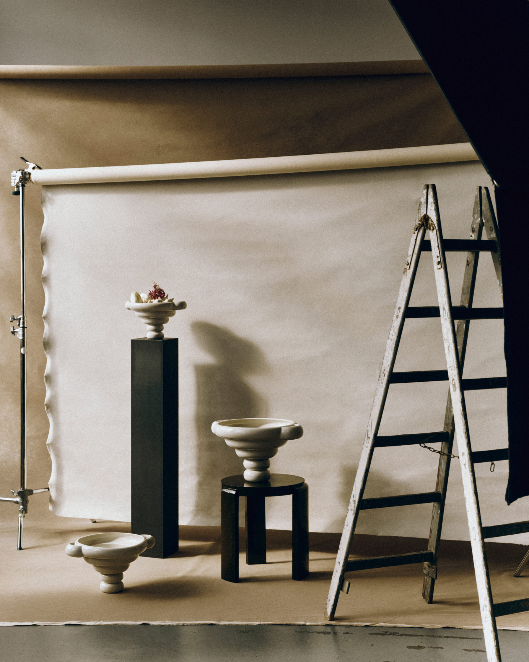
Your universe is rooted in Bauhaus principles and Haussmannian aesthetics, two references that are geographically and culturally distant. How do you reconcile them within a single object?
The attraction of opposites is what makes it interesting. Finding balance is something we all strive for in our everyday lives, whether consciously or intuitively. The masculine clarity of Bauhaus and the feminine elegance of the Haussmannian style complement one another naturally. To me, they represent two opposing yet harmonious forces - much like the balance between masculine and feminine qualities found in nature. It is often in the meeting of these contrasts that beauty, character, and harmony emerge.
The Alice Object is suited to both private interiors and hospitality spaces. Do you think differently about an object depending on the environment it is destined to inhabit?
When I design, I am often at home, working at my dining table, where I naturally imagine how an object will live in a residential setting. When I move to my office, which is located behind the gallery, I begin to see the design in a different context and imagine how it can be presented at its very best within a gallery space. Moving between these two environments often influences the outcome of my work. It is one of the reasons I frequently develop my designs in different sizes and scales, allowing them to respond naturally to a variety of spaces and settings.
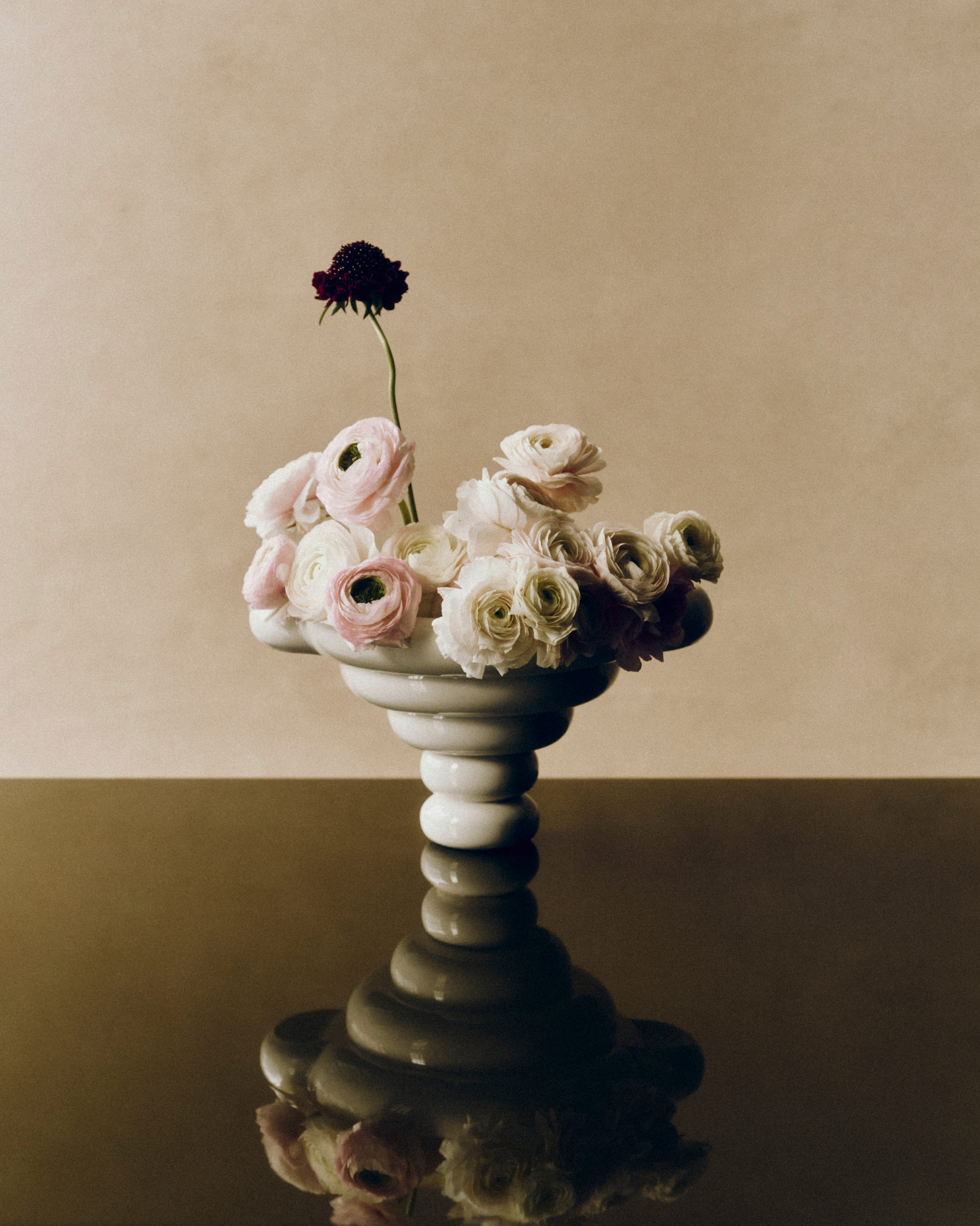
"Senses makes and creates it all."
The Louise Roe Gallery in Copenhagen integrates a café, The Roe Bar. How does sensory experience in the broader sense, including taste or scent, feed into your vision of design?
Senses makes and creates it all. All senses are somehow in play no matter if its music for the ears, Food for the tongue, smells for the nose, surfaces and textures for the touch and feel and shapes for the eyes. Tasting with your eyes includes how a room is created and being in that specific space makes it complete if you play with many senses at one time. I am a bit of a foodie always looking forward what to eat at my next meal. So, for me it’s natural to bring food into the interior scene.
If Alice, your companion, could see the object that bears their name, what do you think they would make of it?
Alice - my dog, would be dreaming of an Alice Object filled with cheese…!
Plus d'articles